Favorite Logo?

Which logo is your favorite?

  • Seasons 1-4 (1981-85)

    Votes: 18 60.0%
  • Season 5 (1985-86)

    Votes: 2 6.7%
  • Seasons 6-8 (1986-89)

    Votes: 10 33.3%
  • Season 9 (1989-90)

    Votes: 0 0.0%

  • Total voters
    30

ClassyCo

Telly Talk Superstar
LV
5
 
Messages
4,326
Reaction score
5,174
Awards
11
Member Since
September 2013
I initiated this topic over on the KNOTS LANDING forum, and @Michelle Stevens brought it to the DALLAS one. Both threads have healthy discussions going thus far, so I figured it was time to bring the discussion over the FALCON CREST way.

Which logo for the show was your favorite?​

Season 1-4 (1981-85)
1652371629911.png


Season 5 (1985-86)
1652372222556.png


Seasons 6-8 (1986-89)
1652372274375.png


Season 9 (1989-90)
1652372311740.png
 

ClassyCo

Telly Talk Superstar
LV
5
 
Messages
4,326
Reaction score
5,174
Awards
11
Member Since
September 2013
I'll go ahead and get this conversation rolling. I voted for the logo used for season six through eight. While the version used for the earliest seasons occupy that time period when FALCON CREST was in its prime, I'm more attracted to the colors and background scenery (especially the view of Angela's home, the vineyards, and swimming pool) used in the later version.

1652380891799.png

Like I said, this logo was used during the show's heyday. During this time, FALCON CREST achieved its highest ratings and dished out its juiciest and best storylines. My favorite cliffhanger -- the one closing out Season 2 -- has this logo attached to its intro. But there's something that strikes me as a little bleak about it -- I think it's the font they use. The emblem and the colors are good, and the scenery used beforehand is pretty.

1652381035772.png

This one, in my opinion, is the worst of the batch. It's quite simply too much red and it makes the logo look cheap and appear as if it were hastily thrown together. The background scenery is getting to where I like it more, but the pictures of the cast with this dreadful red frame are sour grapes to the eyes. Not a fan of this logo at all, quite frankly.

1652381174529.png

We arrive at my favorite. The colors, the scenery, the font. It all just works out and looks beautiful. When I typically think of a FALCON CREST logo, I usually think of this one. I understand this one was used at a time when the show was in a constant downward spiral, but I like it and personally wished they would've used it earlier in the series' run.

1652381298734.png

Some might toss this logo at the bottom simply because it occupies Season 9, the final chapter most would say is quite dreadful. I'd say the color and -- to a lesser extent -- the font are tolerable, but what I don't like is the vacancy of the emblem. I'm a stickler for the FALCON CREST emblem, and I like seeing it beside, above, or wherever it may be around the logo. Oh, and the theme instrumental this final season wasn't helping anything, either. It's too different from the traditional to be efficient.​
 

tommie

Telly Talk Hero
LV
3
 
Messages
6,244
Reaction score
8,918
Awards
9
Location
Sweden
Member Since
I dunno
Yeah, I'd say the season 6-8 is the best one as it looks the most professional even if it wasn't used at the shows peak.

Season 5's is horrid. I thought season 9's font was fine, but the emblem needed to be in the mix.
 

ClassyCo

Telly Talk Superstar
LV
5
 
Messages
4,326
Reaction score
5,174
Awards
11
Member Since
September 2013
I thought season 9's font was fine, but the emblem needed to be in the mix.
My thoughts exactly. They could've slid the emblem beside the "F" at the beginning or behind the "T" at the end. Either would've probably been fine.
 

Willie Oleson

Telly Talk Schemer
LV
8
 
Messages
19,098
Reaction score
32,980
Awards
22
Location
Plotville, Shenanigan
Member Since
April 2002
Ideally, I'd have the red lettering (after all, it's a soap about blood & wine) without that silly frame, plus the original background as shown in the season 1-4 opening.
And then it should continue for the actors credits (they copped out, but the red frame design made it difficult to use).
A big NO to swimming pools, they're tacky. Except for the swimming pool in DALLAS' first mini-season.
 

Angela Channing

World Cup of Soaps Moderator
LV
16
 
Messages
13,781
Reaction score
25,512
Awards
42
Member Since
1999
The original logo looked the most like a wine label which I think was the effect they were trying to achieve and for that reason it's probably the best logo. I think by season 6 they lost sight that the logo was supposed to look like something that would appear on a wine bottle and the new logo looked more like something designed for the titles of a TV show. It looks great on TV but would be less good on a wine bottle.

As I like the idea of the show's logo looking like it was re-purposed from something that appeared on a wine bottle, I voted for the original one, seasons 1 - 4.
 

ClassyCo

Telly Talk Superstar
LV
5
 
Messages
4,326
Reaction score
5,174
Awards
11
Member Since
September 2013
As I like the idea of the show's logo looking like it was re-purposed from something that appeared on a wine bottle, I voted for the original one, seasons 1 - 4.
And that is certainly a fair assessment of the original logo. On that merit, I view the original in a different light now.
 

Mel O'Drama

Admin
LV
12
 
Messages
13,450
Solutions
1
Reaction score
27,329
Awards
29
Member Since
28th September 2008
Forgetting colours and backgrounds (since we're talking about the logo itself)I was torn between the first two.

Seasons 6-8 looks a bit bling and brassy, with the metallic gradient very of its time (it reminds me of the Return To Eden series), which probably suits the theme tune, but not necessarily the tone of the series itself.

The final logo looks a bit daytime-ish to me. The font is nice, but there's no real personality to the logo overall and the combination of lowercase and uppercase words looks very indecisive and seems to emphasise the word "Crest" unnecessarily.


The font for the first logo is my favourite, and I'm very tempted to choose it on that basis alone, but I think the way it's overlaid in front of the crest makes it look a tad busy.

I like @Angela Channing's reasoning about the wine bottle label, and I can see that. To my eyes, the second version (the all-red) looks even more like a label. Since it's the simplest one there I also think it makes an effective and versatile logo. I don't think the colours do it justice and I'd still go with yellow or white for the font, but the point of logos is that you can tweak the colours depending on the situation, so I'm not paying too much heed to the red. I also like the way the first and last letters of "Falcon" come down to embrace the second word.

Looks like I've talked myself into Version Two.
 

Willie Oleson

Telly Talk Schemer
LV
8
 
Messages
19,098
Reaction score
32,980
Awards
22
Location
Plotville, Shenanigan
Member Since
April 2002
I don't think the colours do it justice and I'd still go with yellow or white for the font
I guess it could have been less screaming red (perhaps with shades of purple) but from an aesthetic point of view it also worked for the first RETURN TO EDEN series, although it appears that bold colours in bold font are a little more prone to blurriness. But then again, the picture quality of RTE (at least the DVD) isn't one of the best.
A small white outline could have fixed that.
1652448795705.png

I've always said that the Angela's mansion looks very "Australian".
incidentally, I wish THE COLBYS had kept the white font when it was still DYNASTY II
I don't believe I've ever heard anyone say pools were tacky.
They're not in Europe, but in America it's not special enough to show off. If I'd give a tour of the FC estate I would conclude it with "oh yeah, and there's the (obligatory) swimming pool", in a semi-apologetic way.
 

Mel O'Drama

Admin
LV
12
 
Messages
13,450
Solutions
1
Reaction score
27,329
Awards
29
Member Since
28th September 2008
I've always said that the Angela's mansion looks very "Australian".

Oh yes. I can see that now you say it.

She might be quite at home at Eden or Woombai or even A Place To Call Home's Ash Park, what with its turrets and gothic flourishes. Certainly I could envisage her here more than the Ewings or Carringtons (could you imagine Jock on this balcony in his blue plaid suit?):


incidentally, I wish THE COLBYS had kept the white font when it was still DYNASTY II

Same here.
 

Michelle Stevens

'The Lovely Michelle'
LV
7
 
Messages
15,632
Reaction score
27,252
Awards
18
Location
USA
Member Since
January 25, 2011
I like Season 6-8 the most. There are no real bad ones. I think the final season's logo would have been nicer if they had kept kept a falcon insignia incorporated into it. Of the four I like the actual font of the final season the most.
 
Last edited:

Jock Og

Telly Talk Addict
LV
10
 
Messages
1,179
Reaction score
5,490
Awards
28
Location
Ireland
Member Since
18th November 2000
I voted for the S1 - S4 presentation, as it achieves the best effect. That being said I like the animated falcon swooping in to create the more rustic looking crest, in season 7. 'FALCON CREST' probably should have been underneath the coat of arms, from the very beginning. Just a slight nitpick.

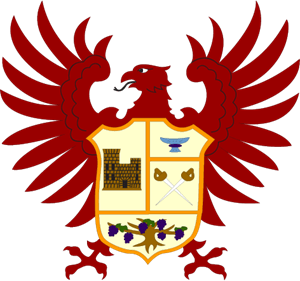
For the first episode of season 5 'The Phoenix' an image of the mansion was solely used within the red frame and then in the next episode the four components of the crest were reinstated i.e. the Gioberti castle; wine goblet, the swords and the vine.

There was a backlash to the new logo in season 9 episode 1 ('The Price of Freedom') so the renowned coat of arms returned in episode 2 ('Charley'), with the name below.


Lance returns to the mansion, after a night courting Terri, (a scene from season 4, 1984-‘85):

Angela appears from the dining room : “Morning Lance!”

Lance: “Incase you were wondering I was out all night.”

Angela: “Oh! Well you missed breakfast.”

Lance: “I was with Terri.”

Angela: “Well I don’t see anything wrong with that. She’s young and she’s a widow.”

Lance: “A wealthy widow. Right grandmother…..?”

Angela: “I don’t know what you’re talking about.”

Lance: “With acres of vineyards you’d love to get your hands on.”

Angela opens her mail to find an invite: “Well Chase & Maggie are giving a party in the winery. Uh that’s outrageous, so close to the tragedy. I won’t be going of course.”

Angela gives Lance the invite.

Lance: “Mrs. Channing regrets.”

Angela: “I don’t see any reason why you shouldn’t go. Terri will be there.”

Lance: “Terri & I don’t need excuses to see each other.”

Angela: “I know that & half of Tuscany knows that. Now I think your little arrangement will be more dignified if you were seen together in public.”

Lance: “You’re not using me to get at her vineyards.”

Angela: “Oh I’m thinking far beyond that. She’s young, she’s beautiful, healthy and one of these days you’re gonna need an heir.”

Lance: “How long do you plan on shoving me into miserable marriages?”

Angela: “Until you get it right!”
 
Last edited:

bmasters9

Telly Talk Mega Star
LV
3
 
Messages
3,103
Reaction score
3,113
Awards
8
Location
LL
I like the first title, albeit I like the version of that title that was used for the second and third gos (1982-84), where the name appeared right at the same moment the falcon stopped (the first go had a delay of about a second before the name appeared).
 

ClassyCo

Telly Talk Superstar
LV
5
 
Messages
4,326
Reaction score
5,174
Awards
11
Member Since
September 2013
While Season 5 may indeed use my least favorite logo, I will say that I really enjoy the instrumental they used that year. It's arguably my favorite opening to the series, at least musically. Oh, and I really like Susan Sullivan's head-turn at the end. This was before they billed her simply as "Susan Sullivan as Maggie" for Season 6.​
 

ClassyCo

Telly Talk Superstar
LV
5
 
Messages
4,326
Reaction score
5,174
Awards
11
Member Since
September 2013
There's no need to initiate a new discussion about this, but I've often wondered: What made Susan Sullivan the standout and get the "and Susan Sullivan as Maggie" billing? Did she just have a very good or wise agent? I've always thought such crediting was awarded to cast members who are breakout stars of their shows, and that wasn't necessarily Maggie.

It's also weird to me that FALCON CREST didn't employ alphabetical billing like DALLAS and KNOTS LANDING, but different producers operate different ways. Perhaps the FC people didn't want to bill alphabetically because that would've put Jane Wyman at the ever end?

1653401872085.png
 
Top